
Project
Fivvy
Industry
Personal Finances
My Role / services provided
Product Designer UX Designer
Client / Project
Wertheim Group
Date
Jan-2020 Dec-2022
Designing a real-time financial decision system
Overview
Fivvy is a personal finance app focused on helping users optimize everyday spending through smart payment recommendations.
Based on financial goals, account status, and credit behavior, the product suggests the best payment method for each purchase.
I joined at a pre-MVP stage, where the product had no users and the value proposition was still unclear.
My role involved:
defining core user journeys
shaping the feature set
designing the recommendation experience
The main success metric was conversion across the initial user journey, making clarity and speed critical.
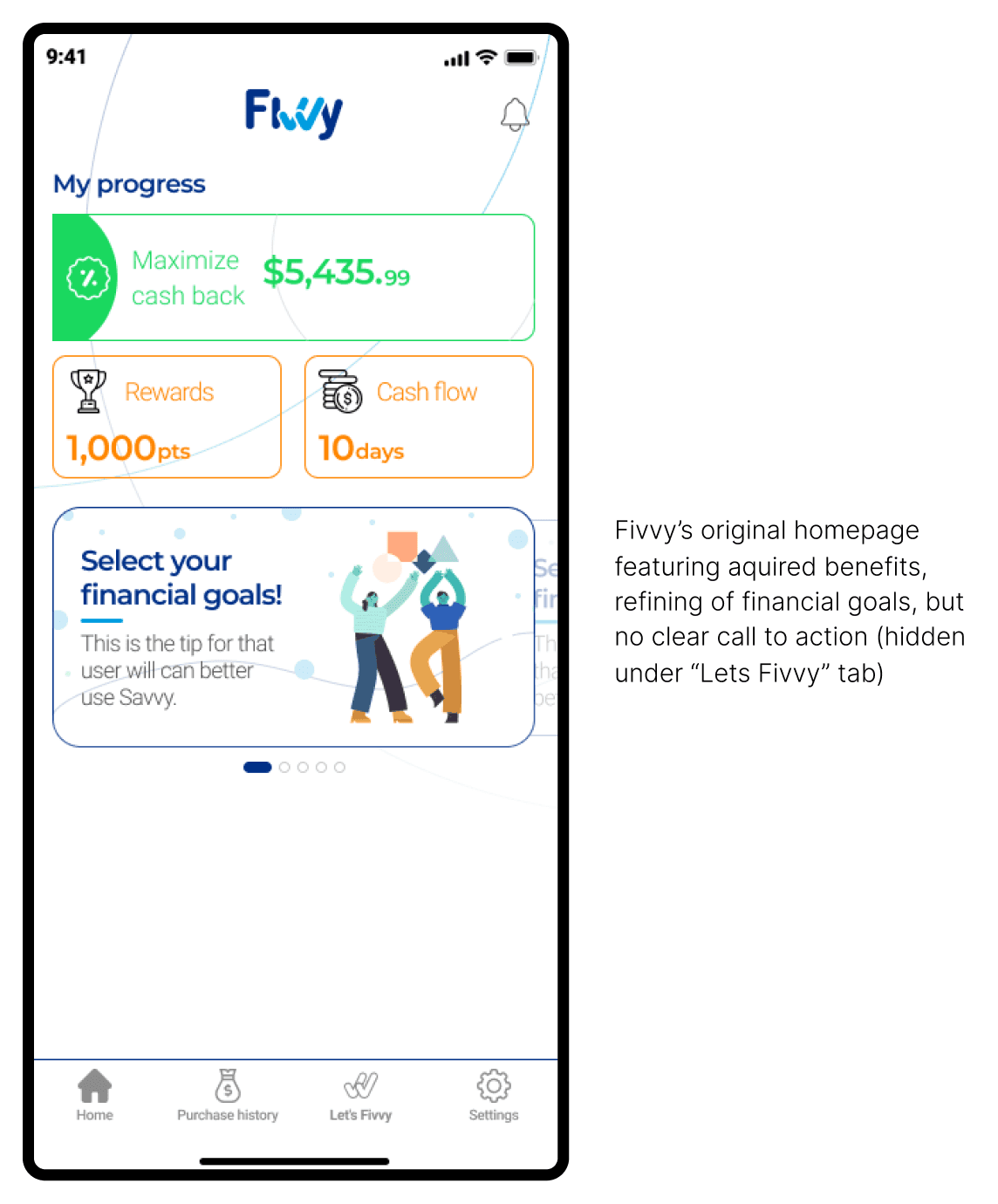
The Problem
A powerful idea that didn’t translate into usable value
The product aimed to recommend the best payment method based on:
rewards (cashback, miles)
billing cycles (payment deferral)
credit utilization (financial health)
While conceptually strong, this created a highly complex decision system that was difficult to communicate and even harder to use.
Value came too late
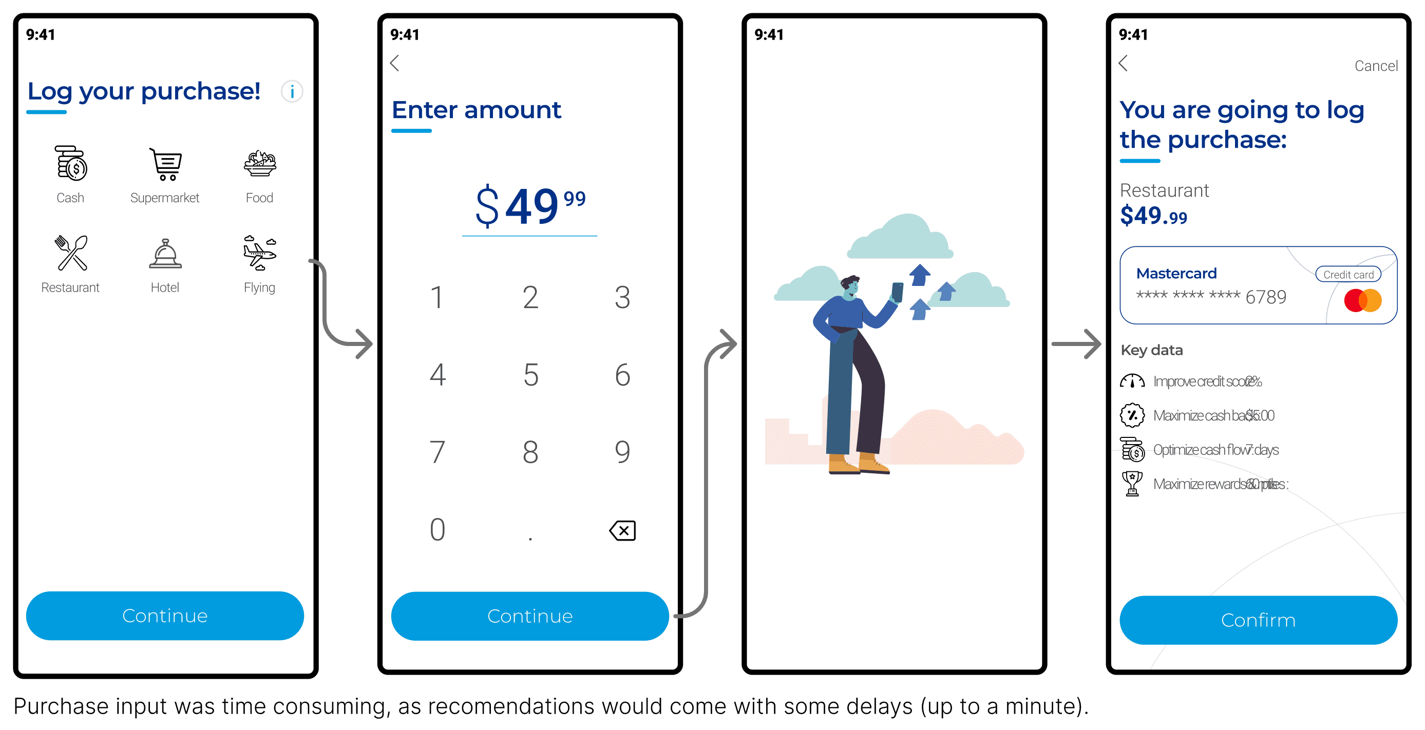
Users had to:
Configure financial goals
Connect accounts (and wait)
Input purchase details manually
Wait for backend processing
Then receive recommendations
This made the product unusable in real-world contexts, like checkout lines where decisions must happen instantly.
High friction to reach value
The experience required:
account linking
manual input
multiple steps before insight
👉 The product delayed value instead of delivering it upfront.
An abstract value proposition
Unlike simpler fintech apps, Fivvy’s core idea was difficult to explain:
dynamic payment recommendations based on financial state
This made it harder to:
onboard users
build trust
communicate benefits
Technical and organizational constraints
backend latency prevented real-time responses
limited access to users for validation
product decisions driven by assumptions
👉 The product risked solving the wrong problem, too late.
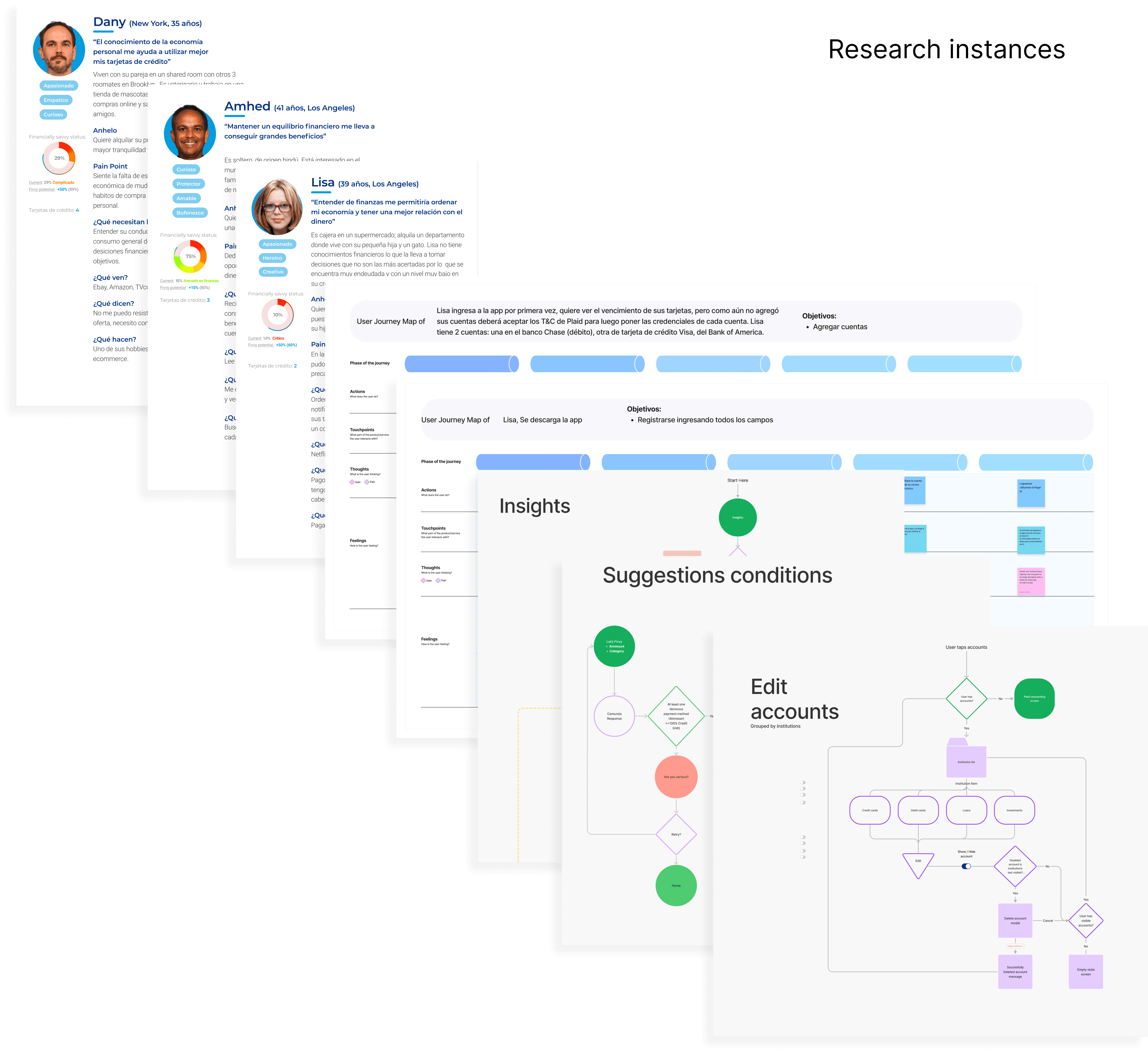
Understanding the System
Turning complexity into decisions
The recommendation system depended on multiple competing variables:
rewards vs credit health vs payment timing
Each payment method could be “best” depending on context.
Structuring the system
Trough research, I mapped the product through:
information architecture models
domain ownership of data
user needs vs informational value
This helped identify what actually mattered at decision time.
Reducing configuration
Originally, users had to define financial goals upfront.
I removed this requirement and replaced it with:
automatic evaluation of all variables
a default ranked recommendation
👉 This reduced friction and accelerated time-to-value.
Designing for speed
To avoid manual input:
I used historical data to create predefined purchase shortcuts
surfaced them directly on the home
👉 Users could trigger recommendations instantly.
Heuristic-based decision model
Instead of relying on slow backend computation:
I designed a heuristic-based system
prioritizing speed and predictability over precision
Trade-offs
speed over accuracy
simplicity over transparency
These decisions enabled real-world usability.
Strategy & Decisions
Simplifying to unlock value
The core strategy was:
prioritize immediate usability over configurability
Key decision: removing goal setup
Users no longer needed to define financial goals.
The system:
evaluated all variables
generated a default recommendation
👉 Shift from user configuration → system guidance
Introducing financial health indicators
I added high-level indicators to:
provide early feedback
build trust
reduce navigation
This required simplifying complex financial data into clear signals.
Risks
less precision
reduced user control
less transparency
But necessary to deliver value in seconds.
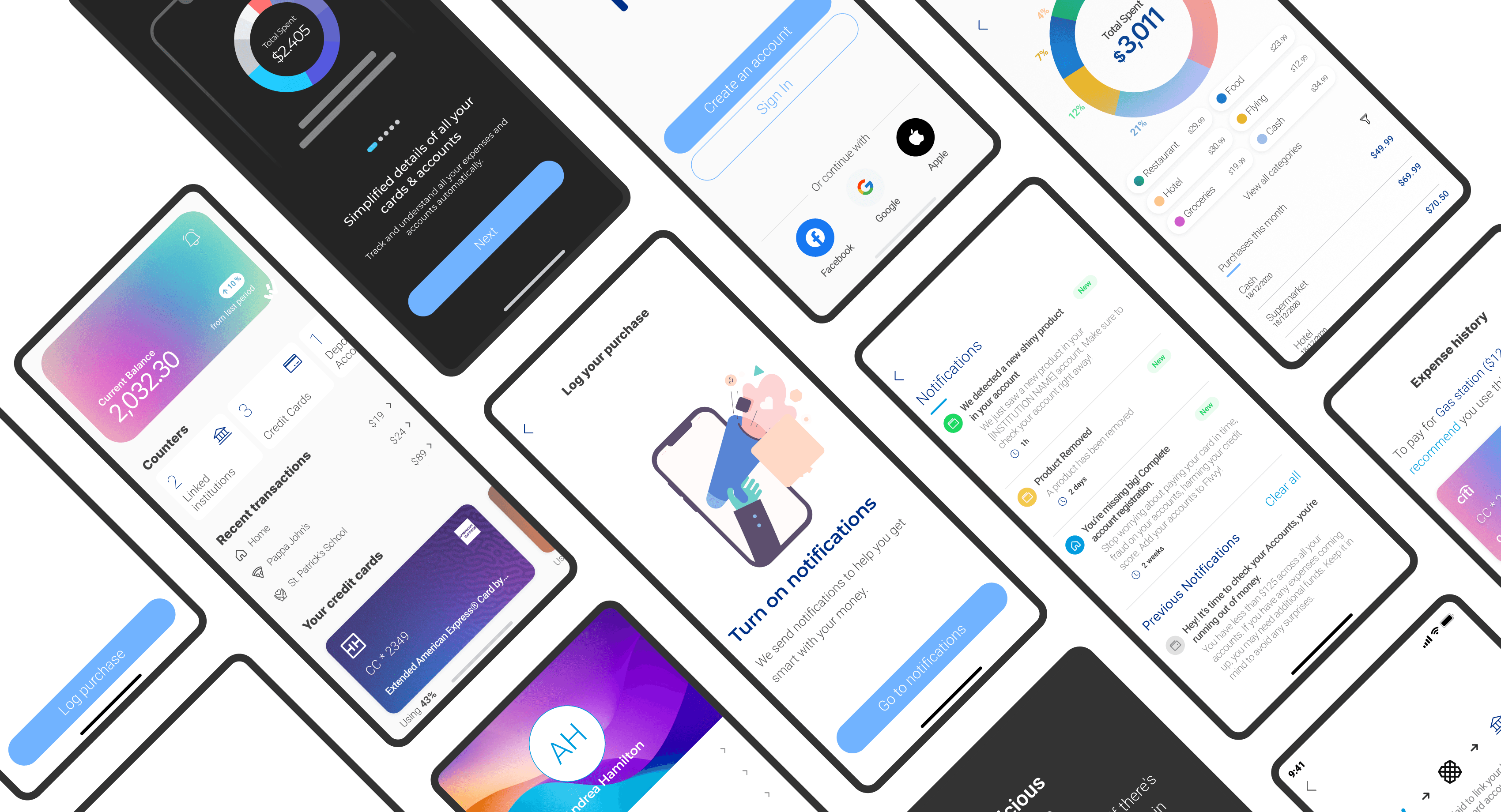
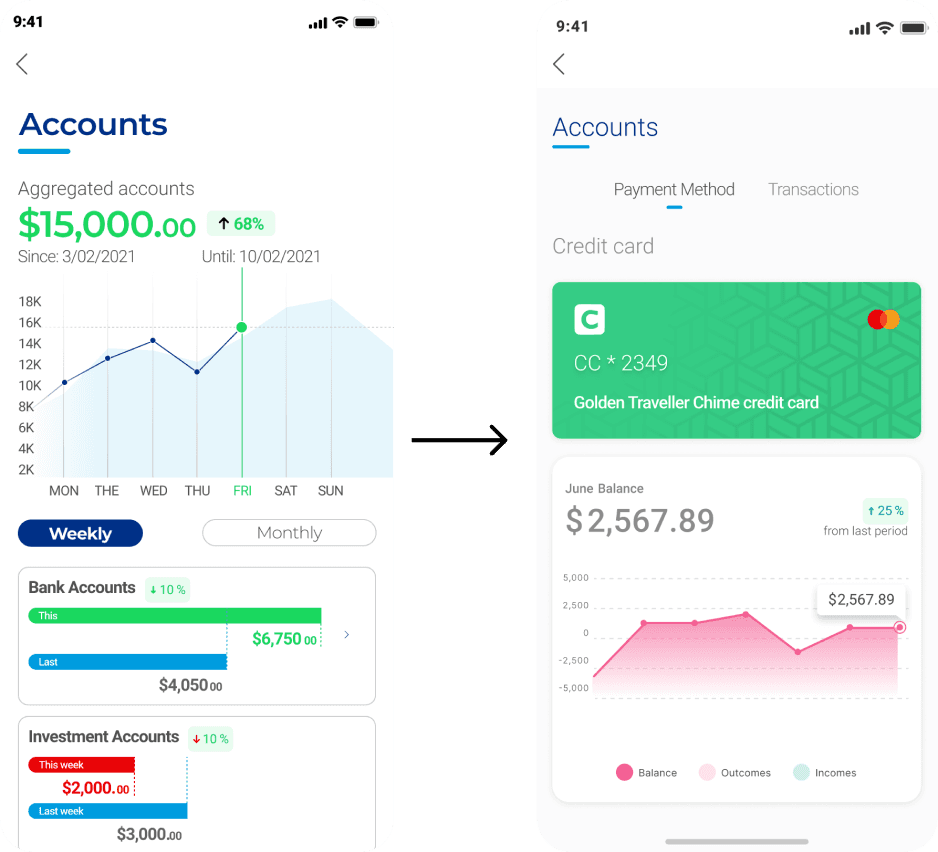
Solution
A decision-first home
The home screen provided immediate context:
consolidated balance
list of payment methods
spending overview
quick access to recommendations
Instant recommendations
Users could:
select a predefined purchase
get a recommendation instantly
Ranked decision model
Recommendations were shown as a:
→ carousel of payment methods (best → worst)
Each option included:
benefits
drawbacks
Visual recognition system
To compare options quickly:
bank colors + logos
texture system for differentiation
👉 Designed for fast scanning under pressure.
Handling latency
A playful loading state:
acknowledged system delay
reduced perceived friction
added personality
Key highlights
home as a decision hub
fast comparison via carousel
reduced interaction cost
Impact
reduced friction in accessing recommendations
improved clarity of product value
aligned experience with real usage context
The MVP launched closely aligned with the proposed solution and later iterations focused on improving clarity through onboarding and visual aids.
Learnings
Bridging product vision and real user needs
The product was driven by strong ideas, but limited validation.
This resulted in:
unclear value perception
delayed user benefit
reliance on assumptions
The limits of feature-driven design
Adding features improved clarity, but didn’t solve the core issue:
lack of deep understanding of user needs
What I would do differently
validate the value proposition earlier
test simpler versions before scaling complexity
prioritize real user behavior over assumptions
Key takeaway
Designing the right product matters more than designing the product right.
Previous project
Next project